
Build50 Events was launching a new B2B event series for leaders in the housing industry. The concept was strong and the relationships were already in place, but there was no brand holding it together yet. Conversations were happening and decisions were being made, with nothing tangible to point to.
They did not need to look bigger than they were.
They needed to look credible.
Build50 Events was launching a new B2B event series for leaders in the housing industry. The concept was strong and the relationships were already in place, but there was no brand holding it together yet. Conversations were happening and decisions were being made, with nothing tangible to point to.
The brand had to earn its place quickly.
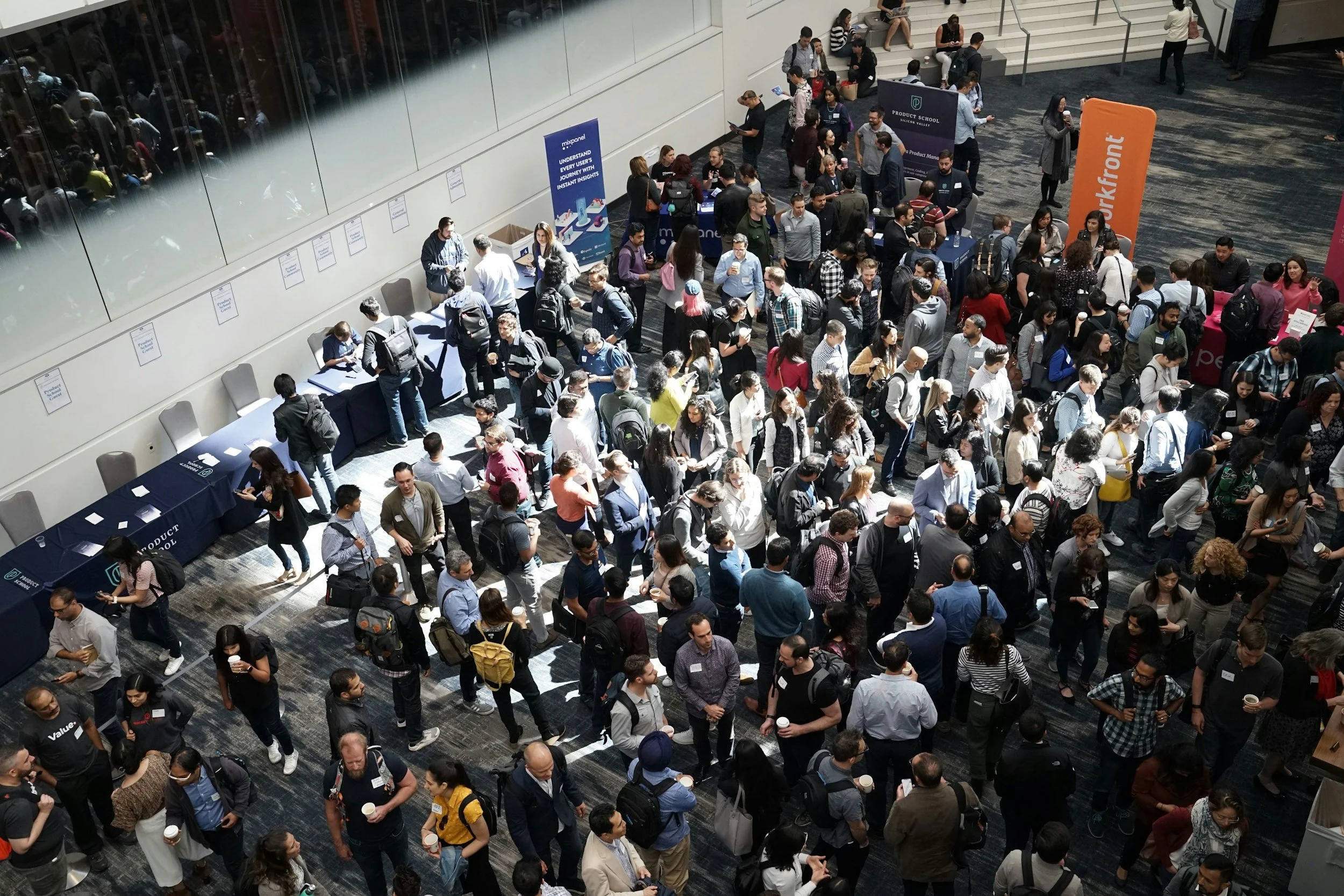
The audience was practical by default. Builders, suppliers, operators. People who are quick to tune out anything that feels like marketing and slower to trust something new.
We focused first on how Build50 should show up.
What it should sound like. What it should avoid saying. Where clarity mattered more than persuasion. The goal was not to impress, but to remove doubt.


Those decisions shaped everything that followed. The website became the first real expression of the brand. It was built to support conversations already in motion, not to create new ones from scratch. The language was direct. The structure was simple. The design stayed out of the way.
We believe in simple ideas, strong relationships, and lasting impact. What began as a passion project has evolved into something more. We’re proud of where we’ve been and even more excited for what’s ahead.
Get in touch.
If you’re building something meaningful, don’t let your brand be an afterthought. We’ll help you get clear—then design something that lasts.